Kayu & Kov makes WPC — wood-plastic composite — profiles out of Bangalore. Fluted profiles, hollow boxes, sheet profiles, louvers, door frames. Their customers are architects and contractors who specify these into projects across India.
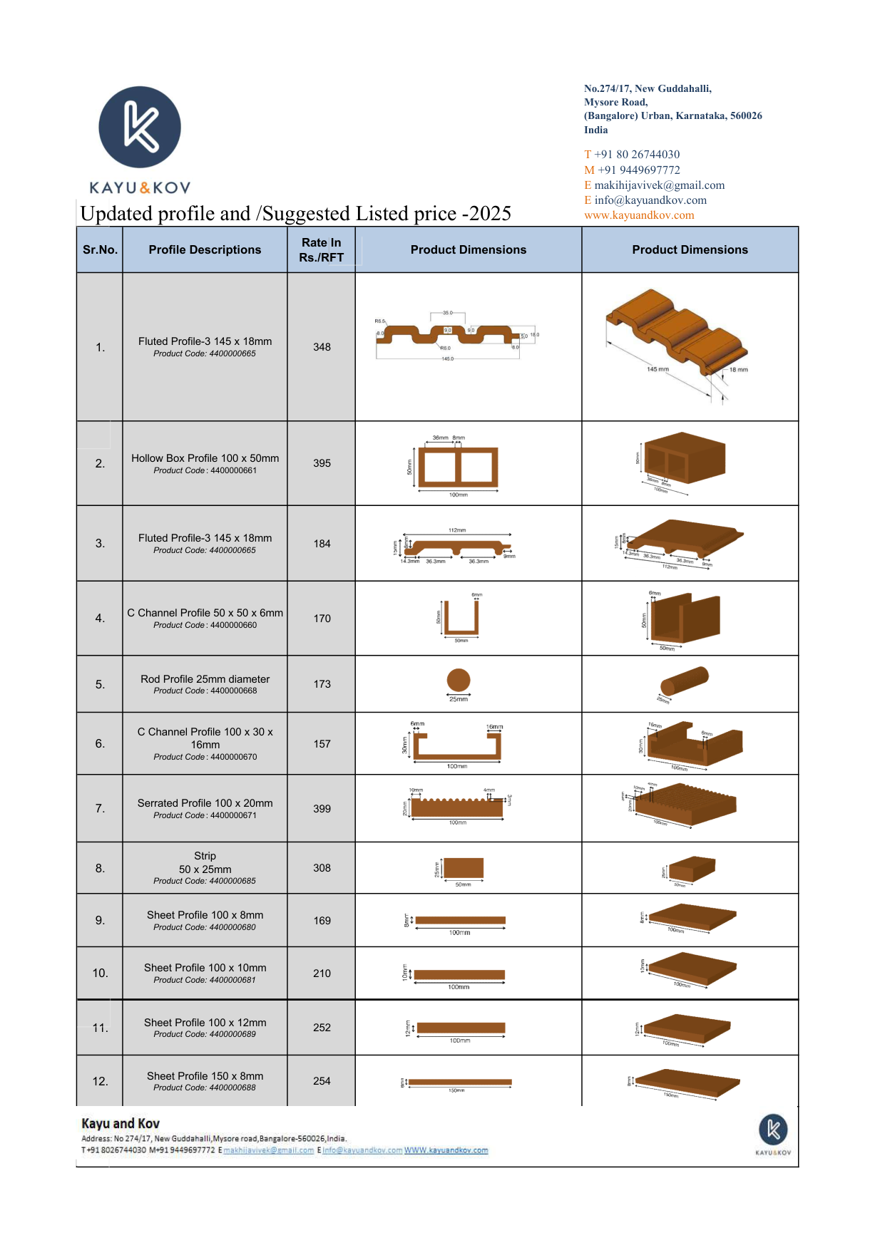
They came to us with a 4-page PDF catalogue listing 55 profiles, and a simple ask: redesign the PDF so it looks better and is easier to read.
We didn't redesign the PDF.
The conversation we had instead
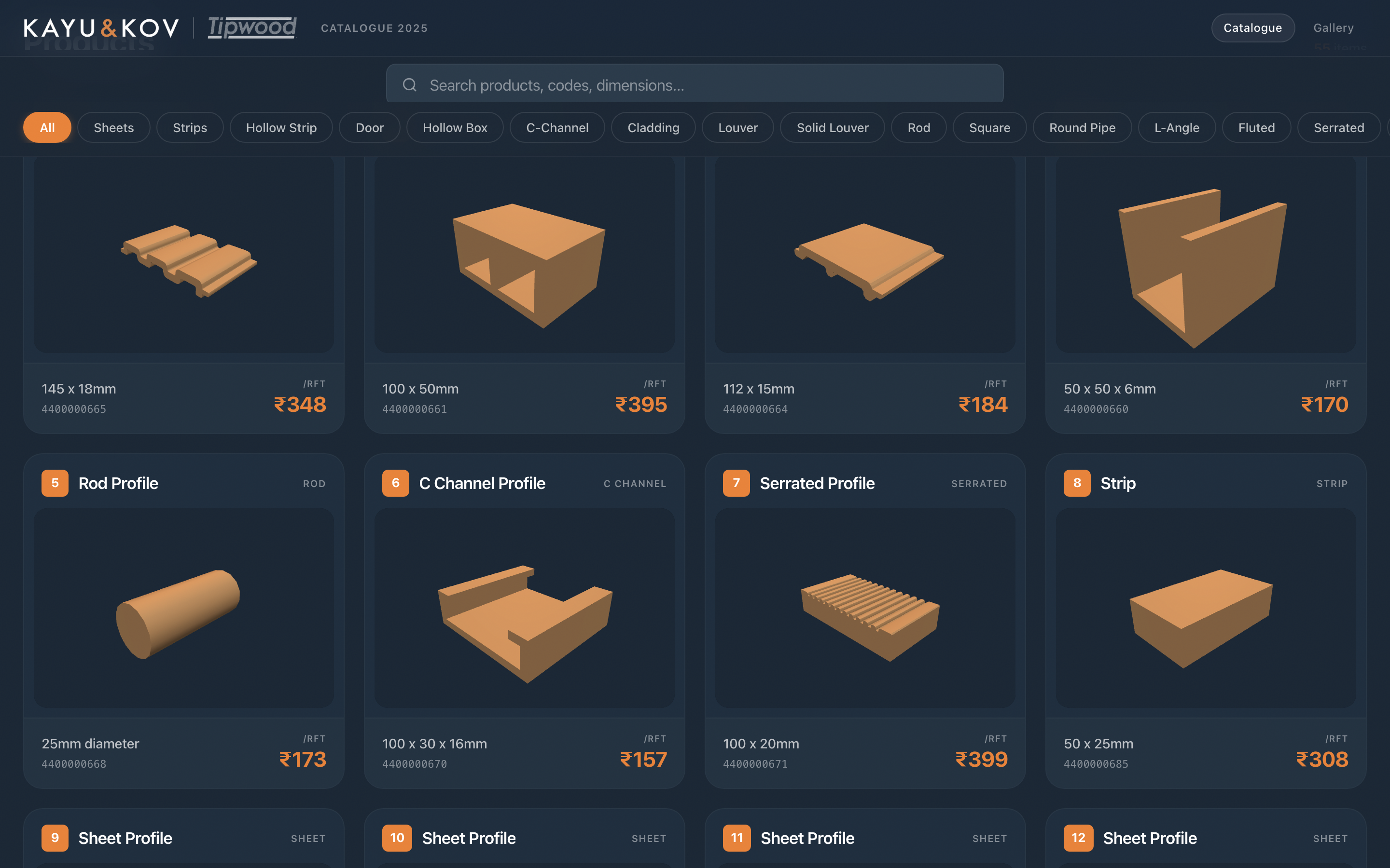
Looking at the catalogue, the problem wasn't that it looked bad. It looked fine — clean tables, 2D dimensions, 3D renderings, codes, rates per RFT. The problem was how architects were expected to use it: open the PDF, scroll through 55 rows, find a profile that fits the section type, dimension, and rate they need, then email the sales team to confirm availability.
For 55 profiles across four pages, this is roughly the worst possible interaction. Too many products to remember by name; too few categories to navigate by intuition; and every spec hidden inside a row that has to be read top-to-bottom before you know whether it's even relevant.
So we made the case for unpacking it into something that actually answered the architect's question.
What an architect actually needs
Architects don't shop a catalogue the way a consumer shops a website. They come in with a brief — "I need a fluted profile around 145mm wide, ideally under ₹400 per RFT, with a 3D rendering I can drop into my visualisation." The job of a catalogue, for that user, is to let them filter to the matching profiles in seconds and see the visual identifier they need.
A PDF can't do that. A website can. So we built one.
What we shipped
In four weeks, Kayu & Kov got a live web catalogue covering all 55 profiles. Same brand. Same renderings. New shape.
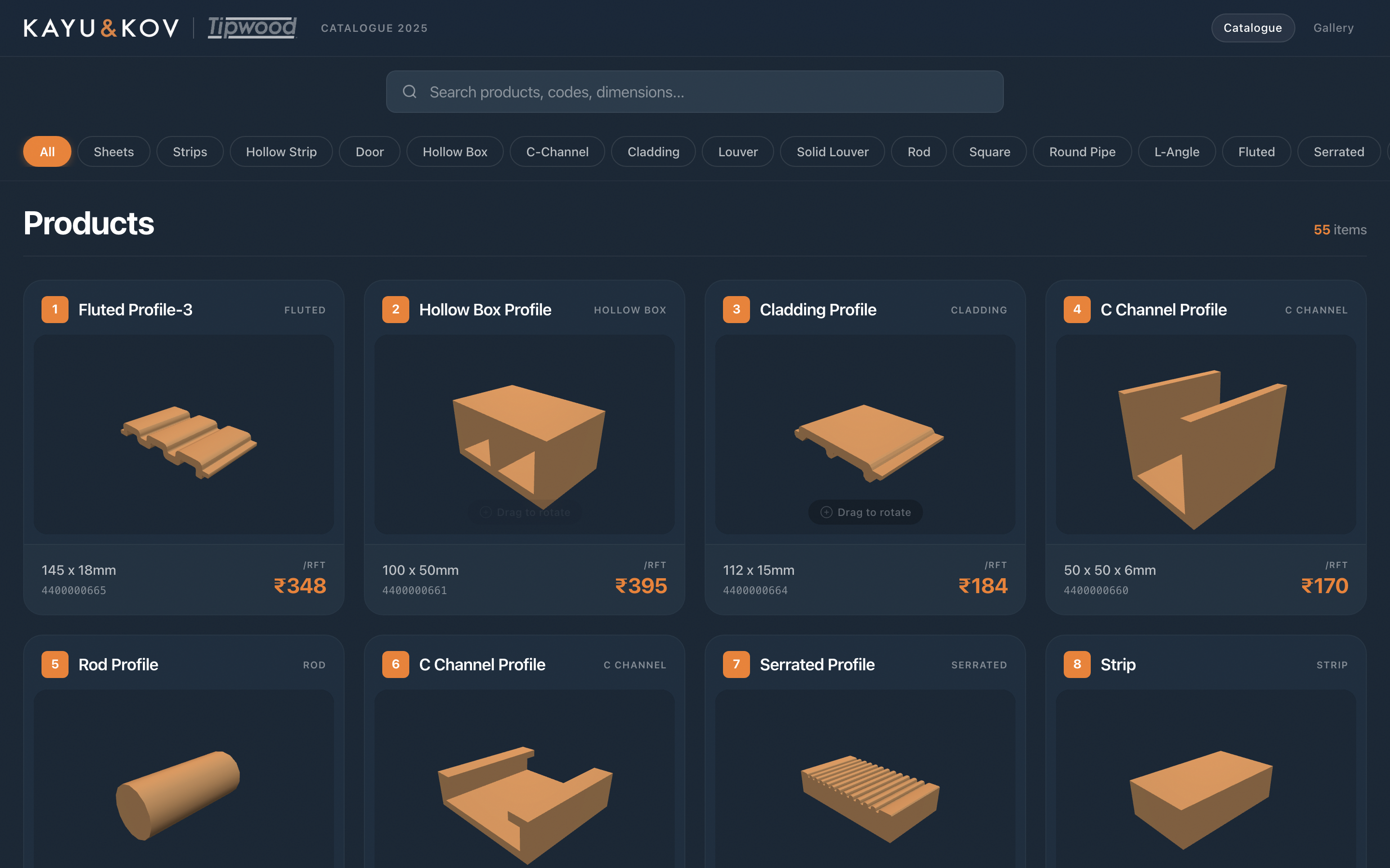
Three moves did most of the work:
- Filter by section type — sheets, hollow boxes, fluted profiles, louvers, door frames, rods, channels — as one-click chips along the top.
- Search by code, dimension, or description — for the architects who already know what they're looking for.
- One-tap order on every card — the sales team gets an email with product code, dimension, and rate pre-filled.
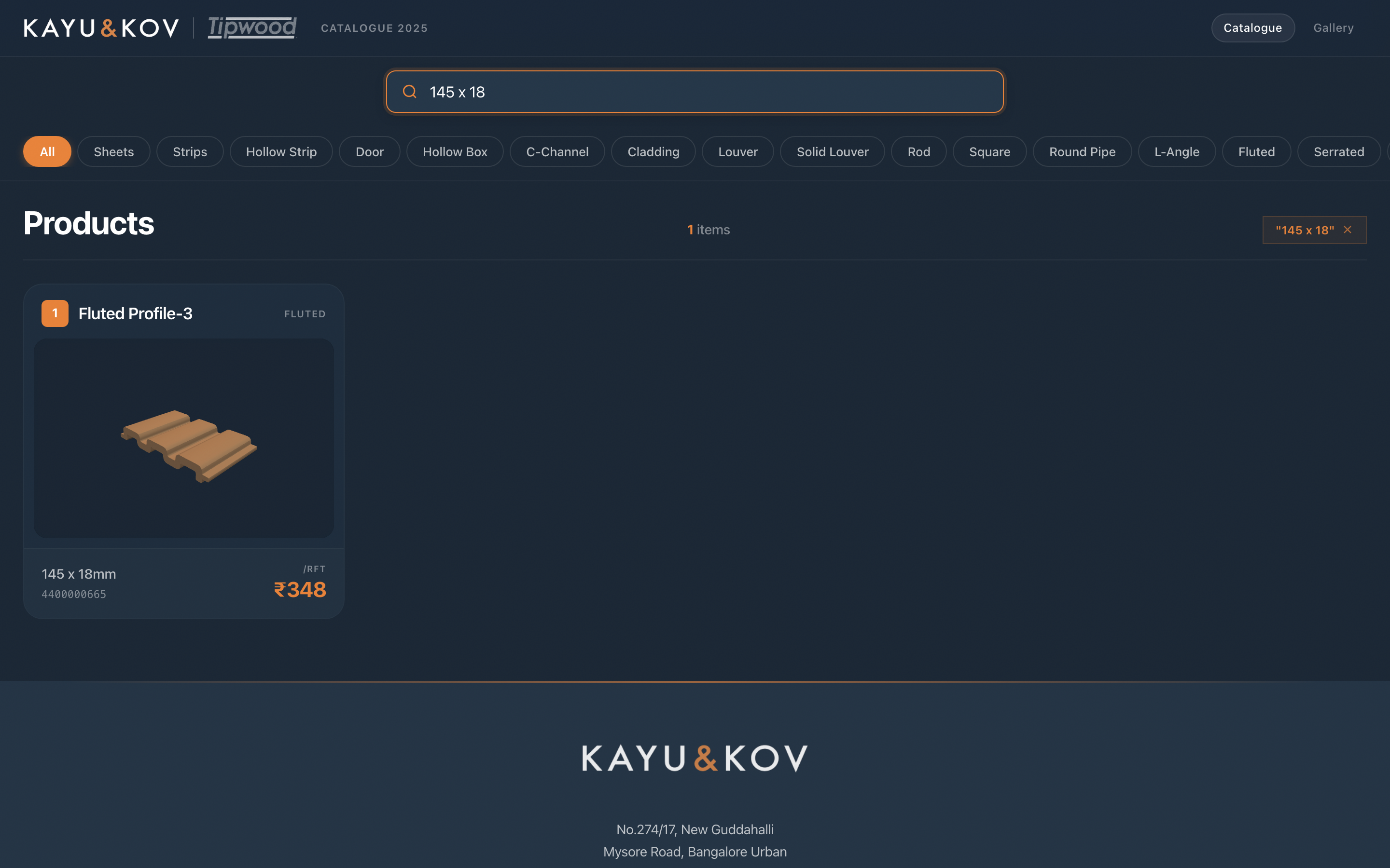
Search resolves a dimension instantly
Architects often arrive with a number — "I need something around 145mm wide". Typing that into the search bar narrows 55 profiles down to the one that matches. No scrolling, no cross-referencing.
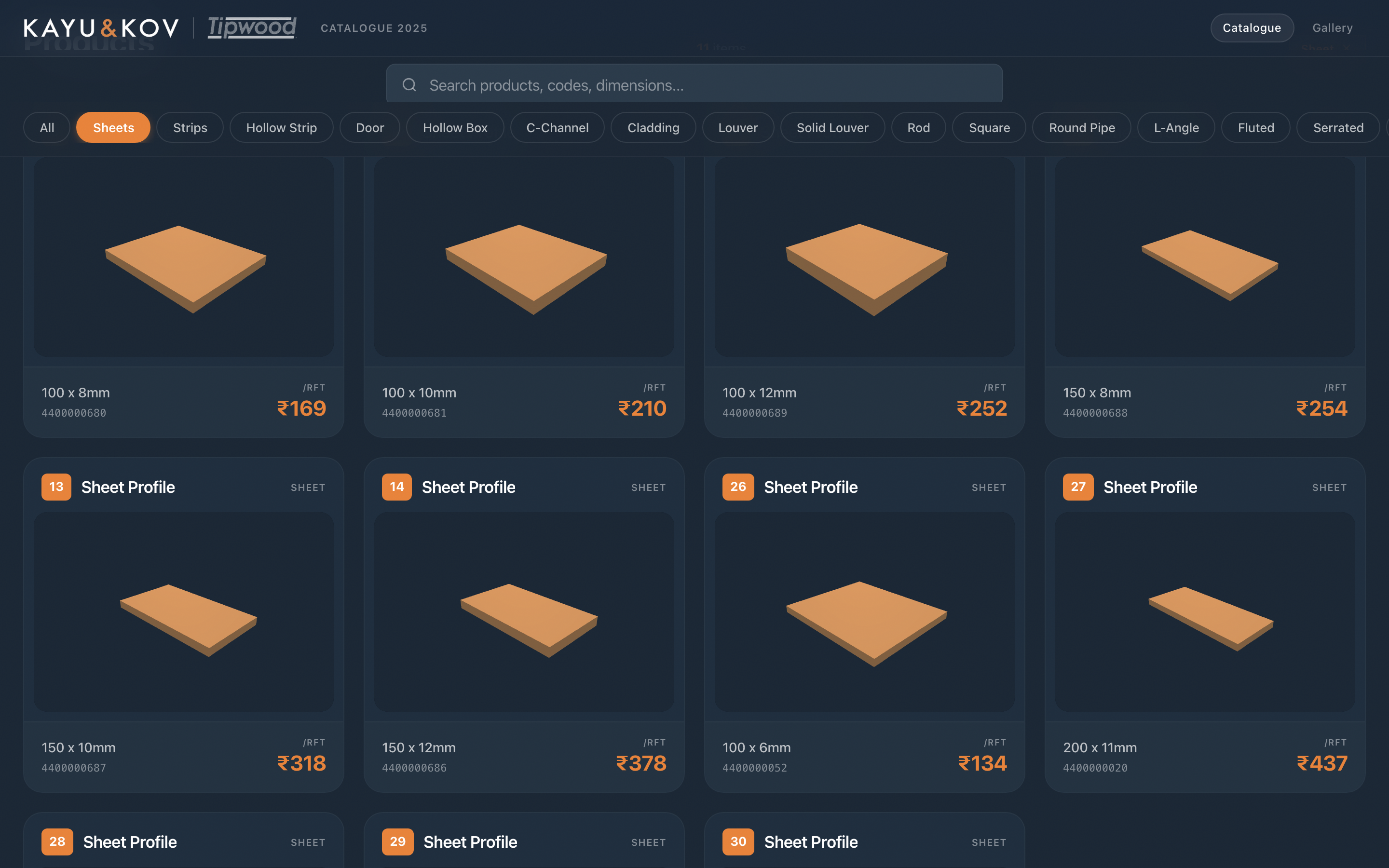
Filters cut 55 down to the family you care about
For architects who don't have a specific number in mind yet — "show me what hollow boxes are available" — the filter chips do the same job categorically.
Every card opens to a useful spec page
When the architect has a candidate, tapping any card opens a full-size spec view: the 3D rendering at scale, full dimensions, code, rate, and the one-click order button. None of these existed in the PDF.
Everything works on mobile too, because architects do half their spec work on phones in site meetings.
The takeaway
The right answer to "redesign our PDF" wasn't a prettier PDF. It was a different shape of object entirely — one that matches how the customer actually uses the information.
A catalogue isn't content to be read; it's a search problem to be solved. Once you see it that way, the redesign brief writes itself.
If you have a catalogue that's drowning your team in spec emails, that's the conversation we'd want to have with you too.
Let’s unpack your catalogue.
Send us your PDF — we’ll build a free 5-product demo from the structure already inside it. No contracts, no credit card required.
Get a free 5-product demoSankalp Shetty
Founder of IndexArch. Helping manufacturers turn static catalogues into interactive sales tools.